What is a homepage structure? A 2026 guide
26 May 2026 · 3 min read
What is a homepage structure? A 2026 guide

Nearly half of all website visitors will abandon a site because of confusing navigation, and yet most business owners still treat homepage design as a question of colours and fonts. Understanding what is a homepage structure means looking beyond aesthetics at the deliberate arrangement of content, navigation, calls to action, and trust signals that guide a visitor from arrival to enquiry. Get it right and your homepage becomes your best-performing sales asset. Get it wrong and you are paying for traffic that leaves without ever engaging.
Table of Contents
Key takeaways
| Point | Details |
|---|---|
| Structure drives conversions | A well-organised homepage layout directly influences whether visitors take action or leave. |
| Navigation must match user expectations | Menus built around business hierarchies confuse visitors; design around what users expect to find. |
| Visual hierarchy guides attention | Strategic use of size, contrast, and placement moves visitors from headline to call to action. |
| Performance affects engagement | A one-second load delay can reduce conversions by 7%, making speed a structural concern. |
| Segment your messaging | Visitors arrive with different goals, so your homepage must speak to more than one type of user. |
What is a homepage structure and why it matters
Homepage structure is the deliberate framework that determines what content appears on your homepage, where it sits, and in what order a visitor encounters it. It is not the visual style. It is the architecture underneath the design.
Think of it as the floor plan of a building. The décor matters, but if the entrance leads directly into a storage cupboard, no amount of paint will fix the experience. The same logic applies to your website.
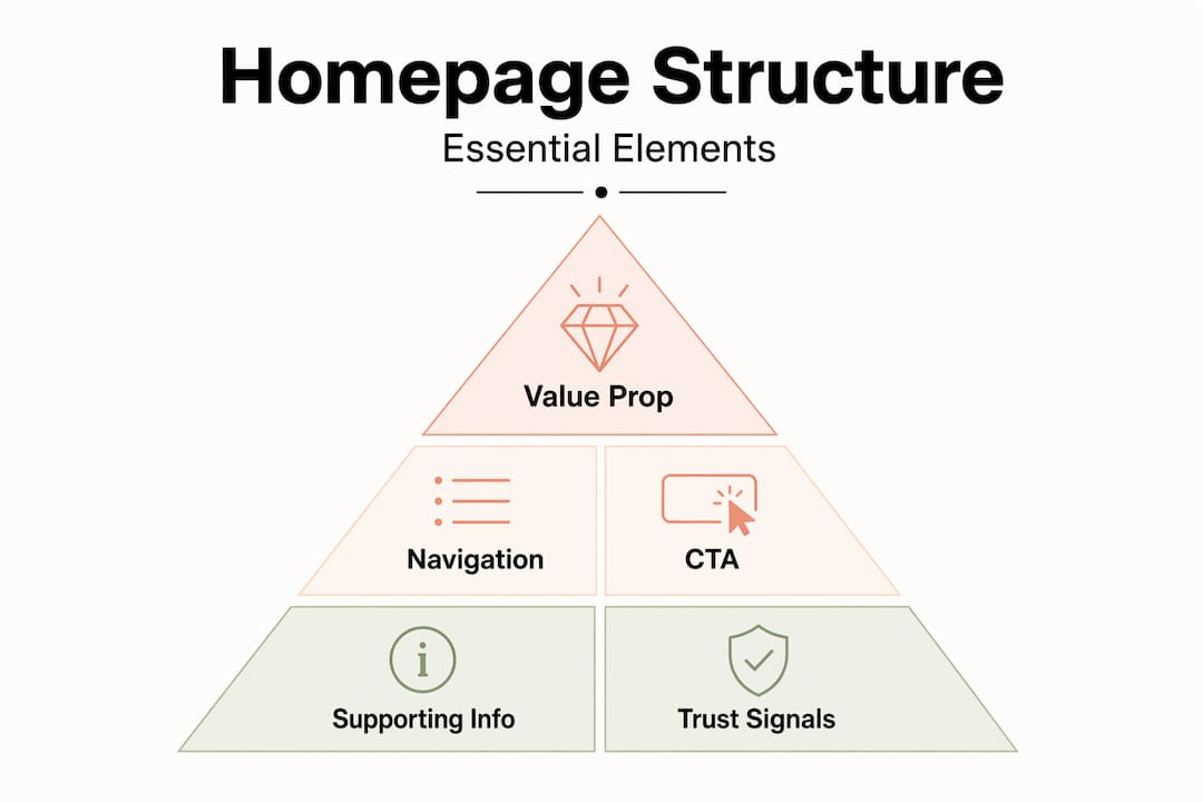
A well-considered homepage structure typically includes these core elements:
-
A clear value proposition above the fold. This is the first thing a visitor reads. It must communicate who you are, what you do, and who you serve. Vague headlines like “Welcome to our website” waste the most valuable real estate on the page.
-
Intuitive navigation. Your menu should reflect how users think, not how your internal team organises its departments. Navigation design principles confirm that menus built around internal company structures cause confusion rather than clarity.
-
Mobile-first responsive design. Over 65% of global web traffic now originates from mobile devices. Your homepage must load fast and display correctly on a small screen before you worry about how it looks on a desktop.
-
Strategic calls to action (CTAs). CTAs guide users from passive browsing to active engagement. They need to be visible, specific, and placed where the user’s attention naturally lands.
-
Social proof and trust signals. Reviews, accreditations, client logos, and case study snippets all reduce the hesitation a new visitor feels. For service businesses in particular, trust is a conversion factor.
Pro Tip: Place your primary CTA both above the fold and again after your first block of supporting content. Visitors who scroll past the hero section are already more engaged, so give them a second opportunity to act.
Visual hierarchy and how users actually scan pages
Most visitors do not read a homepage. They scan it. Understanding this changes how you should organise a homepage entirely.

Research into user behaviour shows that F-pattern and Z-pattern scanning are the two dominant ways people move their eyes across a webpage. The F-pattern is common on text-heavy pages: users read across the top, then scan down the left side. The Z-pattern appears on pages with more visual content, where the eye moves diagonally from top-left to bottom-right. Knowing which pattern your layout triggers lets you place your most important content exactly where eyes land first.
Visual hierarchy prevents cognitive overload by guiding the eye through strategic placement of elements. Here is how to apply it practically:
-
Lead with size. Your headline should be the largest text on the page. It sets the context for everything that follows.
-
Use contrast deliberately. A CTA button in a contrasting colour draws the eye without requiring the visitor to search for it.
-
Group related content. White space between sections signals a topic change. Cramming content together forces the brain to work harder to separate ideas.
-
Place supporting detail below the fold. Your hero section should answer “what is this and why should I care?” Everything else can come after.
The most common mistake in homepage layout is treating every element as equally important. When everything competes for attention, nothing wins. A homepage where the headline, sub-headline, three feature boxes, a video, and two CTAs all appear at the same visual weight leaves the visitor with no clear direction.
Pro Tip: Test your visual hierarchy by squinting at your homepage. The elements that remain visible and distinct are the ones your visitors will notice first. If your CTA disappears into the background, it needs more contrast.
Organising navigation for usability and retention
Navigation is where most homepage structures fail quietly. The problem is rarely that businesses have too few menu items. It is that the labels and groupings reflect internal thinking rather than how customers describe their needs.
Navigation menus are often designed around internal company structures rather than user mental models, and this causes real friction. A plumbing company that labels its menu “Services, About, Projects, Contact” is making sense internally. But a homeowner searching for an emergency repair does not know whether that falls under “Services” or “Projects.” The label should say “Emergency repairs” and remove the doubt entirely.
Two practical methods help you validate your navigation before publishing:
-
Card sorting: Ask a sample of real users to group your content into categories and name those categories themselves. The results often reveal that customers use completely different language to describe what you offer.
-
Tree testing: Give users a task (e.g., “find out how to get a quote”) and ask them to complete it using only your menu structure. Drop-off points show exactly where the labels or groupings break down.
Beyond labelling, the following best practices apply consistently:
| Navigation element | Best practice | Why it matters |
|---|---|---|
| Top-level menu items | Limit to five to seven | Reduces cognitive load and speeds up decision-making |
| Menu labels | Use plain, descriptive language | Avoids confusion caused by internal jargon |
| Header behaviour | Use a sticky header on scroll | Keeps navigation accessible without requiring the user to scroll back up |
| Breadcrumb trails | Include on deeper pages | Helps users understand where they are and how to navigate back |
Poor navigation also affects your SEO. Search engines use your site structure to understand the relationship between pages. A flat, logical navigation hierarchy helps Google index your content correctly and understand which pages carry the most authority.
Nearly half of consumers abandon a website due to confusing navigation. That is not a design problem. It is a revenue problem.
Performance and accessibility in homepage structure
Speed and accessibility are not optional extras. They are structural decisions that affect whether your homepage actually works for the people visiting it.
“A one-second delay in page load time can reduce conversions by up to 7%. For a business generating £10,000 per month through its website, that is £700 lost every month from a single second of unnecessary delay.”
The importance of homepage layout extends to what you choose not to include. Heavy image carousels, autoplay videos, and excessive animations all increase load time without reliably improving conversions. The best-performing homepages tend to be leaner than you expect.
Mobile-first responsive design prioritises essential content before scaling for larger screens. In practice, this means designing your homepage for a 375px wide screen first, then expanding. Content that does not make the cut on mobile probably does not need to be on the desktop version either.
Accessibility is equally non-negotiable. Your homepage should work for users navigating by keyboard alone, and all images need descriptive alt text for screen readers. This is not just about compliance. Accessible design consistently improves usability for everyone, including users on slow connections or older devices.
Pro Tip: Run your homepage through Google PageSpeed Insights and address the top three recommendations. Most performance issues come from uncompressed images and render-blocking scripts, both of which are straightforward to fix.
Aligning homepage structure with business goals
The best practices for homepage structure only deliver results when they are tied directly to what your business needs visitors to do. A homepage is not a brochure. It is a conversion tool, and it needs to be structured with that purpose in mind.
Homepage visitors arrive with different goals and require segmented messaging for maximum impact. Consider the difference between a visitor who has never heard of your business and one who has been referred by a past client. The first needs reassurance and context. The second is already warm and needs a fast route to making contact.
A practical way to handle this is through multiple, distinct CTAs mapped to different user journeys:
| Visitor type | Goal | CTA to offer |
|---|---|---|
| First-time visitor | Understand what you offer | “See how we work” or “View our services” |
| Warm lead | Get in touch quickly | “Request a quote” or “Book a call” |
| Returning visitor | Find specific information | “Read our latest projects” or “View case studies” |
Integrating fresh content, such as a recent project, a new blog post, or a current promotion, also gives returning visitors a reason to engage rather than bounce. Static homepages that never change signal to both users and search engines that nothing new is happening.
Measuring the impact of your homepage structure is straightforward. Track scroll depth, CTA click rates, and bounce rate by traffic source. If organic visitors bounce at a higher rate than referral traffic, your value proposition may not be matching search intent. If mobile bounce rates are significantly higher than desktop, performance or layout is the likely cause.
My honest take on homepage structure
I have worked with a lot of service businesses on their websites, and the pattern I see most often is this: the homepage was designed to impress, not to convert. There is a difference. An impressive homepage looks polished in a browser at full width on a MacBook. A converting homepage gets a plumber in Birmingham an enquiry at 10pm from someone on their phone.
What I have found is that the businesses with the best-performing homepages are not the ones with the most sophisticated designs. They are the ones who made deliberate choices about what to include and, more importantly, what to leave out. Every section on a homepage should exist because it moves a specific type of visitor closer to taking action. If you cannot answer why a section is there, it probably should not be.
The other thing I keep coming back to is navigation. Most business owners approve menus that make complete sense to them and zero sense to a new visitor. The language you use internally is not the language your customers use when they are searching for help. That gap is where enquiries get lost.
Homepage trends will keep changing. AI-generated content, personalisation tools, and new layout conventions will all shift what “best practice” looks like. But the fundamentals of what is a homepage structure, clear hierarchy, logical navigation, fast load times, and a focused path to conversion, will not change. Build for those and the rest follows.
— Ben
Ready to build a homepage that actually converts?
If this article has made you look at your own homepage differently, that is a good start. The next step is doing something about it. At Gtwelve, we build conversion-focused websites specifically for UK service businesses. That means clear value propositions, navigation designed around how your customers think, mobile performance that does not cut corners, and CTAs that generate real enquiries.

We also connect your website into practical business systems, including quote workflows, follow-up sequences, and calendar booking, so the enquiries your homepage generates do not fall through the cracks. If you want a homepage that works as hard as you do, get in touch with the Gtwelve team today.
FAQ
What is a homepage structure?
Homepage structure is the organised framework of content, navigation, and calls to action that determines how visitors experience and move through your homepage. It is the architecture that sits beneath the visual design.
How many items should a homepage navigation menu have?
Best practice recommends limiting top-level menu items to five to seven. Fewer options reduce cognitive load and make it easier for visitors to find what they need quickly.
Why does homepage load speed affect conversions?
A one-second delay in page load time can reduce conversions by up to 7%. Slow pages frustrate users, particularly on mobile, and increase the likelihood they will leave before engaging.
What are the most important elements of an effective homepage?
The core elements of an effective homepage include a clear value proposition above the fold, intuitive navigation, at least one prominent call to action, social proof, and mobile-responsive design.
How do I know if my homepage structure is working?
Track scroll depth, CTA click rates, and bounce rate by traffic source. High bounce rates on mobile or from organic search often point to mismatched messaging, poor performance, or unclear navigation.
Recommended
If this sounds like your website, we can take a look.
Note 61 of 72