Why mobile websites matter for trades in 2026
26 May 2026 · 3 min read
Why mobile websites matter for trades in 2026

Most trade businesses lose leads before a potential customer ever picks up the phone. Understanding why mobile websites matter for trades is the starting point for fixing that. Right now, the majority of people searching for a plumber, electrician, or roofer are doing it on a mobile device, often standing in a kitchen with a leaking pipe or sitting in a car outside a property they need rewired. If your website loads slowly, breaks on a small screen, or buries your phone number three scrolls down, that person moves on to the next result. This guide explains what is happening and what to do about it.
Table of Contents
- Key takeaways
- Mobile usage and trade search behaviour
- Common mobile pitfalls on trade websites
- Mobile optimisation best practices for trades
- Mobile-first versus desktop-first design
- Steps to improve your mobile site now
- My take on mobile and trades
- How gtwelve helps trades get more from mobile
- FAQ
Key takeaways
| Point | Details |
|---|---|
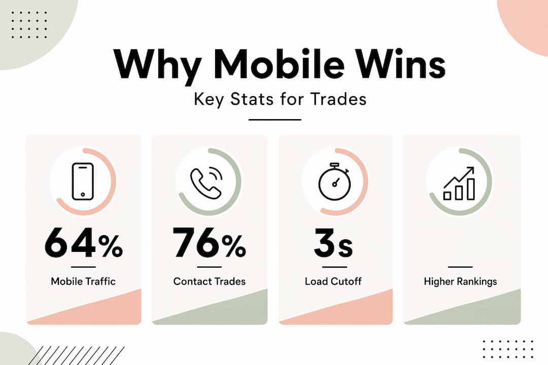
| Mobile dominates trade searches | Over 57% to 64% of all web traffic comes from mobile devices, making mobile the primary channel for new enquiries. |
| Speed kills or converts | 53% of mobile visitors leave if a page takes more than 3 seconds to load, meaning slow sites actively cost you work. |
| Local searches convert fast | 76% of local mobile searches result in a call or visit within 24 hours, so mobile performance directly affects your bookings. |
| Google ranks your mobile site | Google’s mobile-first indexing means a poor mobile experience harms your position in local search results. |
| Contact friction is the biggest leak | Simplifying your contact path, fewer form fields and a visible click-to-call button, is the single fastest way to increase enquiries. |
Mobile usage and trade search behaviour
The numbers here are not marginal. Mobile traffic accounts for between 57% and 64% of all global web visits as of early 2026. For trade businesses specifically, that figure skews even higher because local service searches happen in the moment. Someone’s boiler stops working on a Tuesday morning. They search on their phone. They want a number to call within the next two minutes.
76% of local mobile searches result in a store visit or direct contact within 24 hours. That is not passive browsing. That is high-intent behaviour from people who are ready to book. The impact of mobile websites on business is most visible here: if your site fails at that moment of high intent, the work goes to a competitor whose site loaded properly and had a visible phone number.
There is also a direct SEO consequence. Google’s mobile-first indexing evaluates your mobile site as the primary version for ranking purposes. A slow or incomplete mobile experience does not just frustrate visitors. It actively reduces your position in the local search pack. For trades that rely on Google to generate work, this is a practical business problem with a measurable cost.

| Metric | What it means for trades |
|---|---|
| 57–64% of web traffic is mobile | Most people searching for your services are on a phone |
| 76% of local searches convert within 24 hours | Mobile visitors are ready to act, not just browsing |
| Google uses mobile version for rankings | A poor mobile site damages your local SEO position |
| 53% abandon after 3 seconds | Slow load times remove half your potential leads |
Common mobile pitfalls on trade websites
Most trade websites have not been built with mobile users in mind. They were designed to look professional on a desktop screen, then scaled down. The result is a site that may look presentable on a laptop but actively pushes customers away on a phone.
The most common problems are:
- Slow load times. 53% of mobile visitors abandon websites that take longer than 3 seconds to load. Large uncompressed images, unnecessary scripts, and bloated themes are the usual culprits on trade sites.
- Hard-to-tap buttons and links. Small buttons and unreadable fonts cause frustration and drive visitors away. A phone number displayed as plain text that cannot be tapped is a missed enquiry every time.
- Lengthy contact forms. Asking for a name, address, email, phone number, message, and service type before a customer can reach you is too much friction on a small screen. Most people will close the form and move on.
- Navigation that breaks on mobile. Menus designed for a mouse do not translate well to touch. If a user cannot find your services page or your contact details quickly, they will not persist.
- Hidden content on mobile. Some designs hide sections to reduce visual clutter on smaller screens. The problem is that hidden mobile content is ignored by Google for ranking purposes. Content that describes your services, locations, and credentials needs to be visible on mobile.
Pro Tip: Test your own site on your actual phone, not the desktop browser’s mobile preview tool. The experience is often significantly worse than you expect, and identifying problems yourself takes about five minutes.
Mobile optimisation best practices for trades
The good news is that the most impactful improvements on mobile-friendly trade websites are not technically complex. Here is a prioritised list you can work through with your web developer or use to brief one.
-
Get load speed under 3 seconds. Compress all images before uploading, remove unused plugins or scripts, and use a fast hosting provider. Tools like Google PageSpeed Insights will give you a score and a list of specific issues to fix.
-
Add a click-to-call button above the fold. Your phone number should be visible without scrolling and should open the phone dialler when tapped. Replacing slow forms with click-to-call significantly increases enquiries, particularly for emergency trades like plumbers and electricians.
-
Simplify contact forms. For mobile, three fields is a workable maximum: name, phone number, and a brief description of the job. Minimal form fields produce a measurable lift in leads for emergency trade services.
-
Place your key content above the fold. Your service area, primary service, and contact option should all be visible before any scrolling. Most mobile visitors make a decision within seconds of the page loading.
-
Design for thumbs. Buttons should be at least 44 pixels tall, links should have adequate spacing, and navigation should be accessible with one hand. These are not cosmetic details. They determine whether a visitor can actually use your site.
-
Include local SEO information on mobile. Your service areas, town names, and the types of work you cover should appear visibly on the mobile version. This supports both rankings and relevance for local searches.
Pro Tip: Ask a friend or family member who is not in the trades to try and contact you through your website on their phone without any guidance. Watch what they do. You will learn more in two minutes than from any analytics report.
Mobile-first versus desktop-first design
This distinction matters more than most trades realise. Desktop-first design starts with a large screen and tries to adapt downwards. Mobile-first design starts with the smallest screen and builds outwards. The difference in outcome is substantial.
When a site is designed desktop-first, the mobile version is often a compressed and compromised version of the original. Navigation gets awkward, images get cropped oddly, and content gets rearranged in ways that make the page harder to scan. The site technically works on mobile, but it was never actually designed for it.
| Approach | Typical outcome for trades |
|---|---|
| Desktop-first design | Mobile usability is an afterthought; common issues with layout, tap targets, and speed |
| Mobile-first design | Mobile experience is the primary build; desktop expands naturally from a solid foundation |
| No responsive design | Site is unusable on phones; leads are lost entirely; Google rankings drop |
Mobile-first sites enjoy lower bounce rates and higher rankings in Google’s local search pack. For a local plumber or builder competing in a specific area, appearing in that local pack is often the difference between a busy diary and a quiet one.
It is also worth understanding that mobile content visibility is as important as technical performance in Google’s current indexing model. A site where your credentials, service pages, and reviews are only fully visible on desktop will not rank as well as a competitor who surfaces that content cleanly on mobile.
Steps to improve your mobile site now
You do not need to rebuild everything at once. The following priorities will give you the fastest return on effort:
- Audit your current mobile experience. Open your site on your own phone. Check load speed with Google PageSpeed Insights. Note anything that is hard to tap, slow to load, or difficult to find.
- Fix images first. Oversized images are the most common cause of slow mobile load times. Compress every image on your key pages using a free tool like Squoosh or TinyPNG.
- Add a tap-to-call button to every page. If this requires a developer, it is a small job. The return is immediate for any trade that gets a meaningful share of work from phone calls.
- Trim your contact form. Remove every field that is not strictly necessary. Name, phone, and brief description of the job is enough to start a conversation.
- Engage a developer with mobile-first experience. When briefing any web work, ask specifically how they approach mobile-first design and what their process is for testing on real devices.
- Track mobile traffic separately in analytics. Set up Google Analytics or a similar tool to show mobile visitors, bounce rate, and conversion rate as distinct metrics. This gives you a baseline and lets you measure improvement.
My take on mobile and trades
I have reviewed a lot of trade websites over the years. The pattern I keep seeing is that the owner has always tested the site on a desktop computer. It looks fine to them. Professional, even. But the mobile experience is what customers actually judge before they decide to call.
What surprises most trades when they first look at their mobile site properly is the gap between what they assumed and what they find. A site that looked polished on a 27-inch monitor can look cluttered, slow, and confusing on a phone screen.
In my experience, the single biggest overlooked improvement is not speed or design. It is contact friction. The number of steps between a motivated potential customer and actually reaching you is too high on most trade sites. One well-placed, obvious phone number or a form with three fields will outperform an elaborate website that makes people work to get in touch.
Mobile site improvements are also the fastest return on marketing spend I have seen for local trades. Paid ads, social media, and SEO all take time. Fixing a slow, friction-heavy mobile site produces results within days, simply by retaining the visitors you were already getting but losing.
— Ben
How gtwelve helps trades get more from mobile

At gtwelve, we build mobile-first websites specifically for trade professionals and local service businesses across the UK. We do not adapt desktop designs downwards. We build from the smallest screen up, making sure your phone number is prominent, your contact path is short, and your site loads quickly on any device.
Beyond the site itself, we connect your enquiries into practical follow-up systems so no lead goes cold. If you want to see where your current mobile site is losing you work, get in touch with the gtwelve team for a no-obligation assessment of your mobile readiness and local search performance.
FAQ
Why do mobile websites matter for trade businesses?
Most trade customers search on a mobile device and 76% contact a business within 24 hours of that search. A poor mobile site means losing those high-intent enquiries to competitors.
How does mobile site speed affect my leads?
53% of mobile visitors leave if a page takes more than 3 seconds to load. For trades, this translates directly to lost enquiries from people who were actively looking to book.
Does Google treat my mobile site differently?
Yes. Google’s mobile-first indexing uses your mobile site as the primary version for ranking. A slow or incomplete mobile site will rank lower in local search results, reducing your visibility to potential customers.
What is the fastest improvement I can make to my mobile site?
Adding a visible, tap-to-call button and reducing your contact form to three fields will produce the fastest increase in enquiries for most trade websites, with minimal technical work required.
Do I need a separate mobile website?
No. A properly built responsive website adapts to any screen size. The priority is that mobile usability is designed from the start, not added as an afterthought to a desktop-first build.
Recommended
If this sounds like your website, we can take a look.
Note 60 of 72